I remember a wedding three years ago where the bride had spent a small fortune on hand-painted signage and bespoke floral arches, but the entire reception was essentially a minefield for her grandmother. The “beautiful” gravel path leading to the marquee turned a simple walk into an expedition, and the heavy, vintage oak doors were a joke for anyone with a mobility aid. Most people think accessibility is about a ramp tucked away in the back near the bins, but that’s not how accessibility should be planned; if your guests have to take the service entrance just to join the party, you haven’t planned for inclusion, you’ve planned for segregation.
I’m not here to sell you on expensive consultants or aesthetic-driven checklists that look good on a PDF but fail in a crowded room. I’m going to tell you how to actually map out your floor plan, your transitions, and your guest flow so that nobody feels like an afterthought. We’re going to talk about the unsexy logistics—the width of the service aisles, the placement of the restrooms, and the timing of the transitions—because a seamless event is one where everyone, regardless of how they move, can actually get a drink in their hand without a struggle.
Table of Contents
Universal Design Standards the Blueprint for Effortless Flow
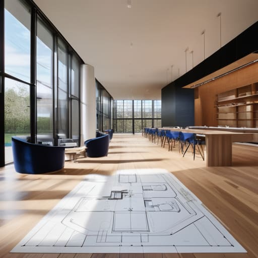
When I walk into a room for a site visit, I’m not looking at the drapery; I’m looking at the floor plan to see where the bottlenecks are going to happen. You can talk all you want about aesthetics, but if you aren’t applying universal design standards from the jump, you aren’t hosting an event—you’re hosting an obstacle course. I’ve seen too many “chic” setups where the narrow walkways between cocktail tables make it impossible for a wheelchair to navigate without bumping into a tray of champagne. It’s not just about being polite; it’s about the physics of the room.
True inclusive design principles mean the layout works for everyone without making anyone feel like they need a special permit to move. If your guest in a wheelchair has to take a “special route” through the kitchen to reach the dining hall, you’ve failed the logistics test. You want a seamless flow where the person with a mobility aid, the parent with a double stroller, and the guest with a cane all move through the space with the same level of dignity and speed. If the design doesn’t account for that, your “effortless” evening is going to feel very clunky, very fast.
The Invisible Friction of Poor Ada Compliance Planning
I’ve seen it a hundred times: a wedding looks spectacular on Instagram, but the moment the reception starts, the logistics fall apart because someone forgot that a “scenic” gravel path is a nightmare for a wheelchair. This is the invisible friction of poor ADA compliance planning. It’s not just about a ramp being present; it’s about whether that ramp is tucked behind a service entrance where guests feel like an afterthought, or if it’s integrated into the natural flow of the room. When you treat accessibility as a secondary thought, you aren’t just breaking a rule; you are creating a physical barrier to the very celebration people paid thousands to enjoy.
It shows up in the smallest, most grating ways. It’s the guest who has to ask three different staff members just to find a quiet corner because the acoustics are a sensory assault, or the person who realizes halfway through the toasts that they can’t actually navigate the gap between the dining tables. True inclusive design principles aren’t about adding a lift as an emergency measure; they are about ensuring the transition from the ceremony to the bar is seamless for everyone. If your guests are busy calculating how much effort it will take to move from point A to point B, they aren’t actually at your event.
The Logistics of Inclusion: Five Things Your Spreadsheet Won't Tell You
- Stop treating the ramp like an afterthought. If you tuck the accessible entrance around the back near the bins because it’s “more efficient” for your floor plan, you haven’t planned an event; you’ve planned an insult. The accessible route needs to be the primary route, not the consolation prize.
- Audit your floor plan for “dead zones.” I’ve seen weddings where the dance floor was beautiful, but the space between the tables and the music was so narrow a person with a mobility aid couldn’t even turn around, let alone join in. If your guests can’t navigate the room without a navigator, your layout has failed.
- Plan for the “sensory hangover.” Accessibility isn’t just about wheels and ramps; it’s about the person who can’t handle the sudden blast of a DJ’s bass or the strobe lights during the first dance. If you haven’t designated a quiet zone—away from the bar noise and the speakers—you’re effectively telling those guests their time is up.
- The bathroom math is real. You can have one “accessible” stall, but if that stall is at the far end of the building and the queue for the main toilets is twenty deep, you’ve created a logistical bottleneck that will derail your entire evening timeline. Check your capacity against your facilities, not just your guest list.
- Communicate the “how,” not just the “where.” Don’t just put a tiny icon on the invite. Tell people exactly where the lift is, how many steps are at the entrance, and where the quiet space sits. People don’t want to arrive at a venue and spend the first forty minutes of your event performing a reconnaissance mission just to find a seat.
The Final Walkthrough
At the end of the day, accessibility isn’t a specialized sub-category of your event brief; it is the very floorplan you are building upon. If you wait until the week before the licence end to realize your ramp is too steep or your service entrance is a bottleneck for wheelchair users, you haven’t just made a mistake—you’ve broken the event. We’ve talked about the blueprint of universal design and the invisible friction that occurs when you treat compliance like a last-minute chore. Remember: if the flow of the room fails for one person, the logistics of the entire evening are compromised. You cannot fix a structural oversight with a polite apology and a heavy-handed usher once the guests have already arrived.
I’ve stood in the back of a hundred rooms, watching the clock tick down, and the weddings that truly shine are the ones where no one has to ask for help to simply exist in the space. When you plan for accessibility from the first site visit, you aren’t just ticking a box for the regulators; you are removing the barriers to human connection. An event is a logistics problem wearing a nice outfit, and a truly well-planned event is one where every single guest can focus on the toast, the dance floor, or the person sitting next to them, rather than wondering how they’re going to get to the bathroom. Plan the hard parts early, so the rest can feel effortless.
Frequently Asked Questions
How do I balance making the space accessible without making it look like a hospital ward or a government office?
You don’t make it look like a hospital; you make it look intentional. The mistake people make is treating accessibility as an “add-on”—a clunky ramp shoved against a beautiful stone wall at the last minute. That’s when it looks like an afterthought. Instead, build the access into the architecture. A wide, elegant doorway or a gentle, integrated slope doesn’t scream “compliance”; it just screams “good design.” If it feels like part of the original plan, nobody notices the utility—they only notice the flow.
When I’m looking at a venue's floor plan, what are the specific "red flag" measurements I should be checking for myself?
Look at the clearance between tables. If you’re seeing less than 1.5 metres between chair backs, you don’t have a dining room; you have an obstacle course for anyone with a mobility aid or a double pram. Check the doorway widths too—if they look narrow on the blueprint, they’ll feel like a bottleneck in reality. And for God’s sake, check the ramp gradients. If it’s too steep to walk up comfortably, it’s just a decorative wall.
At what point in the budget does accessibility stop being an "add-on" and start becoming a non-negotiable line item?
The moment you move from a “concept” to a “site plan,” accessibility stops being an add-on. If you’re waiting until the final budget review to look at ramps or restroom widths, you’ve already lost. You don’t “add” accessibility to a floor plan; you build the floor plan around it. Treat it like your power requirements or your catering service—it’s a core utility. If it isn’t in the initial line items, you aren’t budgeting; you’re just delaying a crisis.